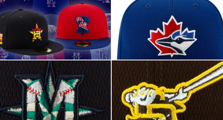
Every year, New Era releases new Spring Training hats for each of MLB’s 30 teams and usually, they’re pretty freakin’ cool:
Whoa – The New Spring Training Caps Are Way Different and Totally Awesome https://t.co/a7woHBysgw pic.twitter.com/n6a0utU5I6
— Baseball is Fun (@flippingbats) November 21, 2017
But this year … Well this year, they went a different route, and I’m not so sure they stuck the landing:
Exclusive: New Era releases the all-new 2020 #MLB Batting Practice and Spring Training caps!
Details, pics, and a contest to win one of the new caps right here: https://t.co/rEJOFgCkuE pic.twitter.com/oY1J38ojpe
— Chris Creamer (@sportslogosnet) February 4, 2020
Click over to the New Era link right here and scroll through each team’s gear if you’d like a hearty chuckle. But basically, they just took two logos from each team and … superimposed one over the other, which is just. Woof.
I think Corey Freedman nailed the reasoning:
We all yelled at MLB (deservedly so) for the boring AF black and white Player’s Weekend jerseys last season, so they doubled down the other direction…
“They don’t like plain? Fine! We’ll give them two logos at once photoshopped over each other!” https://t.co/7flQ8xyuh0
— Corey Freedman (@CFCubsRelated) February 4, 2020
Like, what is this?

Bold. That’s what.